Watercolor Unleashed-Paint Oak Creek

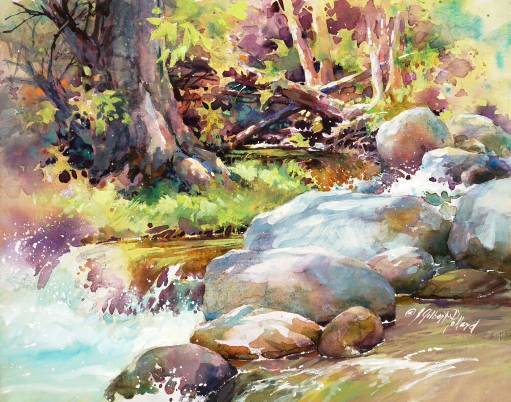
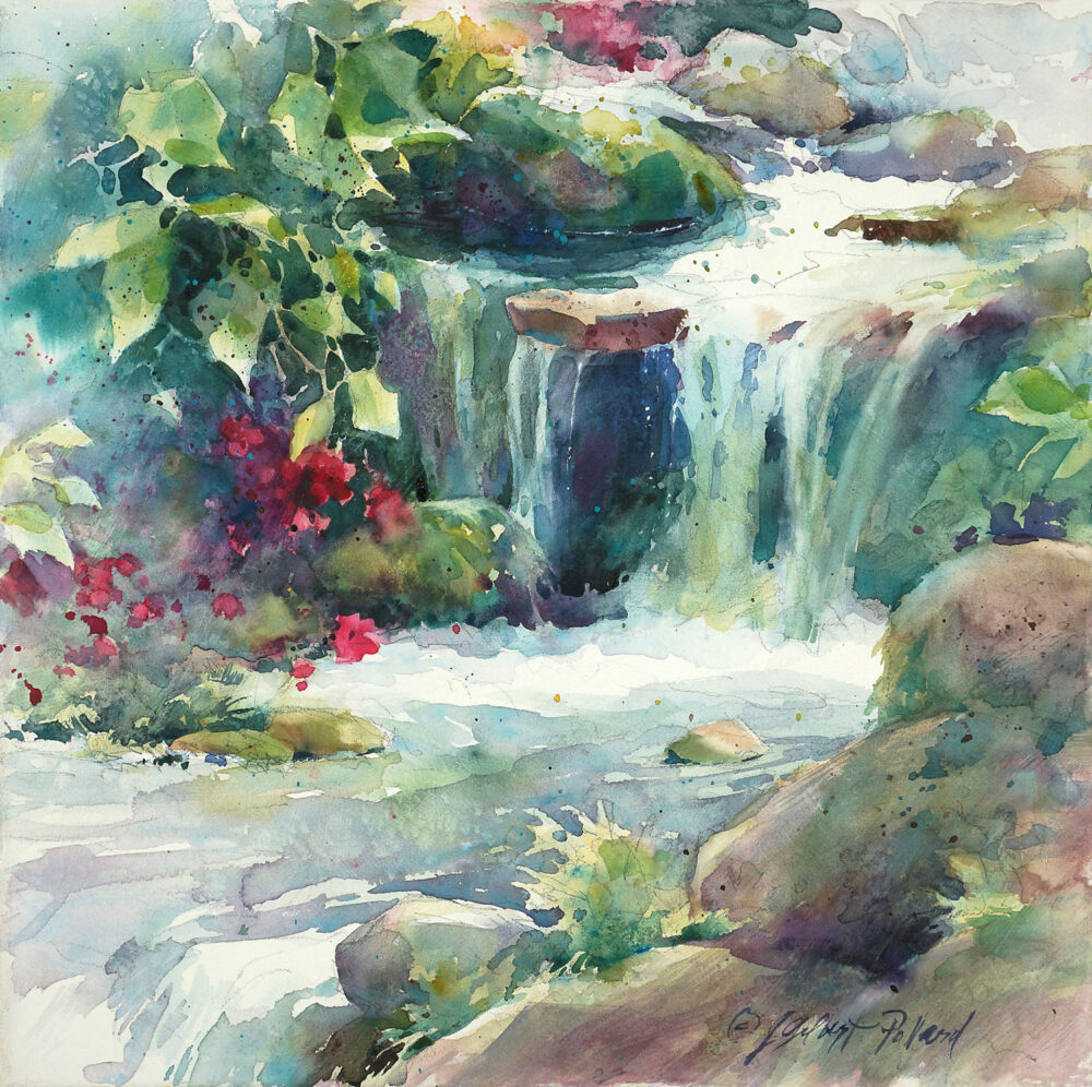
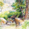
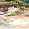
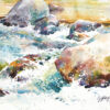
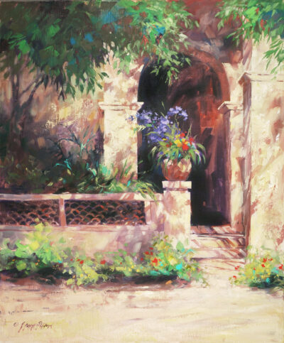
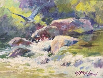
JGPollard_Forest-Secrets_web
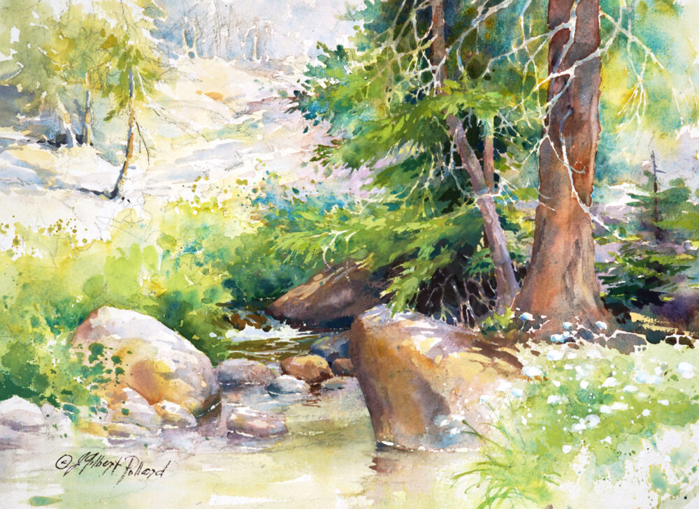
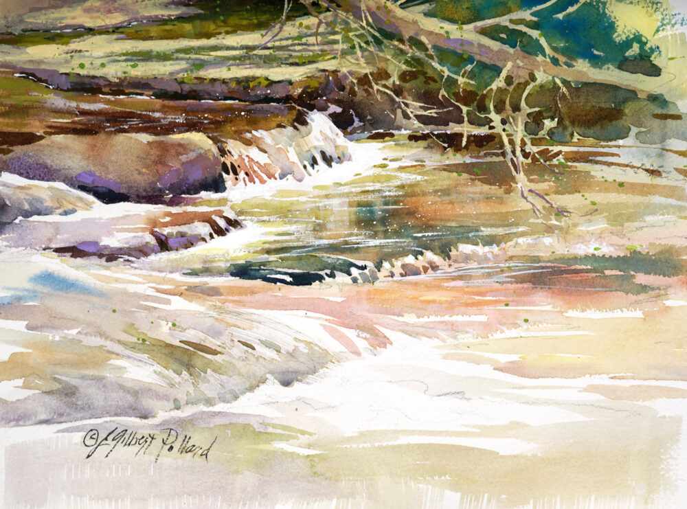
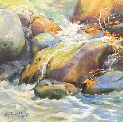
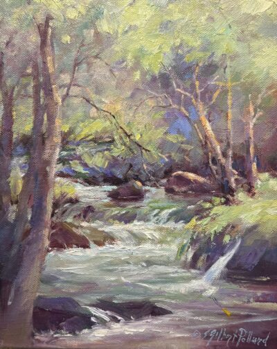
JGPollard_The-Source-II_web
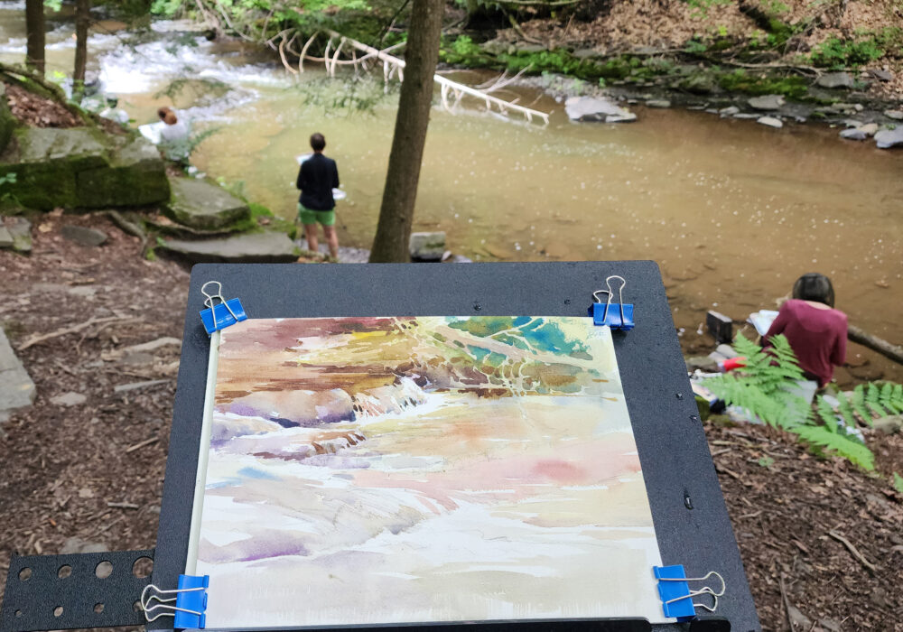
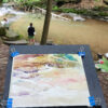
JGPollard_demo at HRVAW, plein air day at Huyck_2024_2
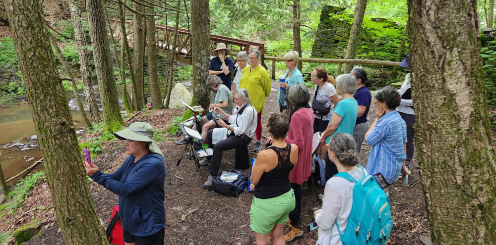
JGPollard_demo at HRVAW, plein air day at Huyck_2024_1
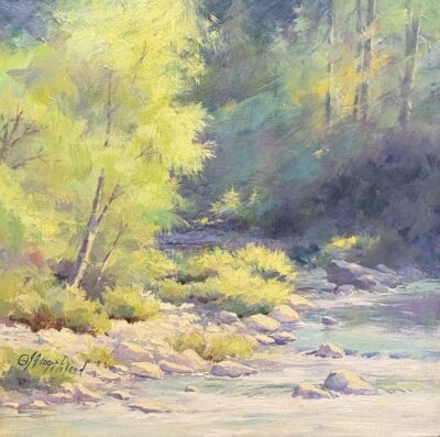
JGPollard_Impatiens-by-the-Creek_web
JGPollard_demo-at-HRVAW,-plein-air-day-at-Huyck_2024_3
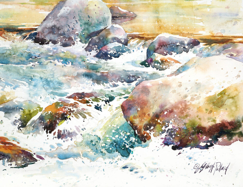
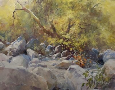
JGPollard_Oak-Creek-at-Briar-Patch-XXII_web

Description

Watercolor Unleashed-Paint Oak Creek
with Julie Gilbert Pollard

Wednesday-Friday, April 29-May 1, 2026 | 9:30 am – 4:30 pm

  • Experience: All Levels Welcome. The only prerequisite is an attitude of joy in the act of painting!
  • Medium: Watercolor. Gouache and Acrylic are optional.
  • Materials: Click the tab above for a list of materials students need to bring with them.
  • Registration: Each student needs to enroll individually.
  • Location: Plein Air and in Studio at the Sedona Arts Center, Theatre Studio in the Art Barn.

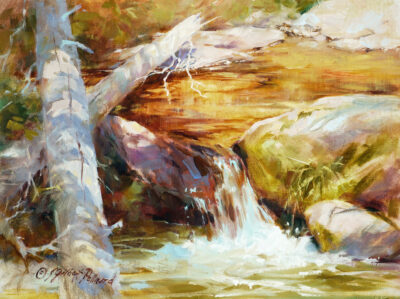
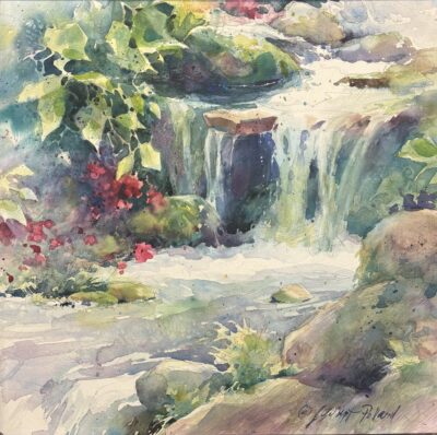
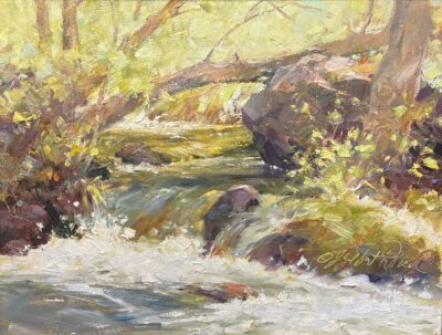
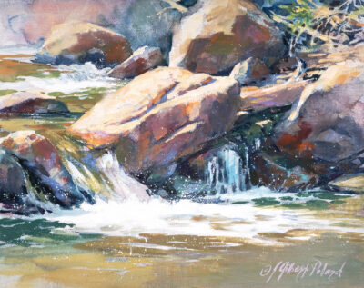
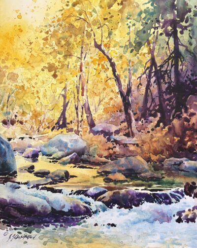
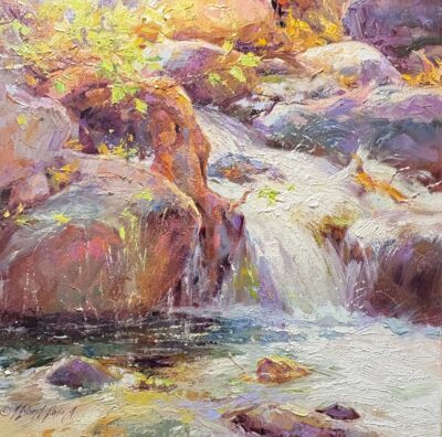
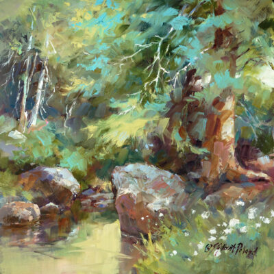
Wet & Wild! Using a combination of watercolor and gouache (gouache is optional) learn to paint water that looks wet, reflective, and splashy. With a stunning creek scene as your model, paint water as it cascades, then splashes around and over the rocky streambed. Techniques will be demonstrated to address the various puzzles with which the artist is faced when painting this stunning, fascinating and challenging subject!
STUDIO LESSONS WILL FOCUS ON:

  • Basic “anatomy” of a waterfall / water cascade…
  • Learning to paint rocks that look solid and hard…
  • The watercolor painting process – keeping it manageable…
  • Watercolor and gouache methods and techniques that apply to the subject-matter…
  • Using your reference photos as inspiration rather than absolute visual fact – maintaining a plein air “feel” and sensitivity in your painting when painting from photos…

Note: you will be more than welcome to use Julie’s reference photo and follow her steps OR use your own reference material OR do BOTH by applying the “follow-along” steps to your own composition.

  • Negative painting lessons for watercolor…
  • Creative use of color – color mixing – painting with green – “using color as value” (as seen in her North Light Books and Videos)…

There will be demos, instruction at all levels, critique and lots of painting time. Class time will be structured, yet open enough to accommodate the artistic spirit within us all. All levels are welcome and encouraged to attend. The only prerequisite is an attitude of joy in the act of painting!

NOTE: For all workshops, I have PDF documents/articles I have written and illustrated that apply to the topics being studied in class. Some pages will be given as hard copy to the participants – there may be others shared electronically.


26 0430 JGP

Julie Gilbert Pollard

Julie Gilbert Pollard

Phoenix artist, Julie Gilbert Pollard, paints in oil and watercolor in a fluid, painterly manner. Her painting style, while representational, is colored with her own personal concept of reality… “The eye may see as a camera ‘sees’, but the mind’s eye sees an altered, imagined image, what it wants and hopes to see. It’s that illusive image I try to express in my paintings. This amazing world of ours is often a mysterious, sometimes frightening, place, but is filled with scenes and subjects that excite my eye and imagination!”

Enjoying an extensive and multi-faceted career in art, Pollard is the author of three North Light Books: Discover Oil Painting, Watercolor Unleashed, and Brilliant Color (oil & acrylic), plus nine videos for ArtistsNetwork.com (three Watercolor Unleashed, four Oil Painting Unleashed and two Acrylic Unleashed). Additional publications include numerous articles and book inclusions including Watercolor Artist Magazine (2024, 2021, 2018, 2013), Plein Air Magazine (2023), Practique des Arts (2022), Splash 23

(2022), The Art of Watercolour Magazine (2019), Splash 18 (2017), Acrylic Works 3 (2016), The Artistic Touch 6 (2014), and Art Journey America Landscapes (2011).

She has given instruction in watercolor and oil since 1985 in numerous locations including Italy, Portugal, Canada, Sedona/Oak Creek Canyon in Arizona with Sedona Art Center School of Art, along with many additional states in the US. Current venues include online and in-person classes with, among others, Scottsdale Artists’ School, Shemer Art Center, Madeline Island School of Art/MISA (both Madeline Island on Lake Superior and Santa Fe), to be hosting another Santa Fe workshop in 2026; and Hudson River Valley Art Workshops in New York State which will be hosting her Plein Air to Studio workshop again in 2026.

Over her career, Pollard’s oils and watercolors have hung in numerous juried, and gallery exhibits. Most notable awards: Best Impressionistic Painting in Best of America, National Oil & Acrylic Painters’ Society, and Best Use of Light & Color in Best of America, National Oil & Acrylic Painters’ Society.

Pollard holds four signature memberships: National Oil & Acrylic Painters’ Society, Arizona Watercolor Association, San Diego Watercolor Society and Plein Air Painters of Arizona. Her work is included in many private and corporate collections and is represented in Arizona by Raku Gallery in Jerome and Sedona Arts Center Gallery in Sedona.

JulieGilbertPollard@cox.net                www.JulieGilbertPollard.com

WATERCOLOR UNLEASHED + GOUACHE – Suggested Supply Lists

Julie Gilbert Pollard, Instructor

JulieGilbertPollard@cox.net      www.JulieGilbertPollard.com

This watercolor workshop will incorporate an introduction to gouache. Using opaque watercolor/gouache is OPTIONAL for this class.

I use gouache in two basic ways – both to be introduced in class:

  1. As an addition to traditional transparent watercolor where the goal is to incorporate opaque watercolor/gouache when needed and for the painting to still have the look of a traditional watercolor…

Regardless of my intent for the finished work, I always begin with transparent – or translucent – washes. Therefore, if you are more interested in this first option, it is not necessary to have a full palette of gouache colors unless you really want to – because you can add a little watercolor to gouache white for some opaque finishing touches, when needed.

  1. As a gouache painting from start to finish where the opaque passages allow the transparent/translucent underpainting to show through, but the opaque nature of the gouache to be quite evident. For this option you will want to have a more comprehensive palette of gouache colors. Note – you can still incorporate some of your traditional watercolors.

The choice is yours. NOTE: this is a SUGGESTED list only – if you have your own favorites (colors, paper, etc.) that differ from mine, please feel free to use them – in addition or instead.  You are welcome to use what you already have!

TRADITIONAL WATERCOLOR LIMITED PALETTE:

A basic, comprehensive palette of colors should include a warmer and cooler version of each of the primary colors. The following list of basic colors follows this criterion. Though you do NOT need to have the same colors or brands that I use, my favorite limited palette is listed below, in case you would like to have that info. Most are Winsor & Newton – exceptions are noted after the color:

YELLOW

Winsor Yellow

New Gamboge Yellow (Daniel Smith)

Indian Yellow

RED

Scarlet Lake (Holbein) OR Quinacridone Red

Permanent Rose (Quinacridone Rose)

Quinacridone Magenta

BLUE

Cobalt Blue (Sennelier)

Cerulean Blue

Prussian Blue (Sennelier)

OPTIONAL – one “non-color” such as Indigo, Payne’s Gray, Black, or Burnt Umber to use for a mono-chromatic study – though not necessarily to be used in this class.

OPAQUE-WATERCOLOR/GOUACHE COLOR PALETTE – I have a full palette of opaque-watercolor/gouache colors – and I have listed them ALL below. But that doesn’t mean you need all of them!

Because this class is meant to be an introduction to gouache AND used in conjunction with traditional watercolor, the number of opaque colors absolutely needed for this class is just one – WHITE.

If you would like to expand your palette further, I recommend adding the ones that are underlined.

If you are only interested in primary colors you’ll find them at the top of each – and listed as such.

NOTE: some I have listed are labeled watercolor and some as gouache – please see notations after the colors (if you use the Holbein brand you will find several opaque colors in their watercolor line that are NOT labeled as gouache even though they are opaque. Additionally, Jaune Brillant No1 watercolor and Jaune Brillant No1 gouache are NOT the same colors, even though they share the same name. Feel free to use other brands. All colors listed below are Holbein, simply because that’s the brand I currently use:

PRIMARY or PERMANENT WHITE – both are Titanium White, and I’m not sure of the difference…

ACRYLIC GOUACHE – Primary or Permanent White – acrylic gouache is NOT the same as Gouache – this is OPTIONAL

YELLOW or Yellow-ish

Lemon Yellow Primary (Holbein gouache)

Naples Yellow (Holbein watercolor)

Jaune Brillant No 1 (Holbein watercolor)

Jaune Brillant No 1 (Holbein gouache)

Jaune Brillant No 2 (Holbein gouache)

Marigold (Holbein gouache)

Cadmium Yellow Orange (Holbein gouache)

RED or Red-ish

Primary Magenta Primary (Holbein gouache)

Cadmium Red (Holbein gouache)

Shell Pink (Holbein watercolor)

Lilac (Holbein watercolor)

BLUE or Blue-ish

Primary Cyan (Holbein gouache)

Lavender (Holbein watercolor)

Cerulean Blue (Holbein gouache)

Prussian Blue (Holbein gouache)

Aqua Blue (Holbein gouache)

BRUSHES – use your favorites – these are mine:

  • #12 round Mimik Kolinsky (by Creative Mark – Jerry’s Artarama and Amazon) – this is my new favorite for both mediums.
  • ½”, ¾”, & 1″ Aquarelle (flat brush with beveled tip to the handle), nylon or “blend” (no particular brand) – for both mediums
  • #8, 10, 12 or 14 round (Kolinsky sable, nylon or synthetic/natural blend – a favorite of mine is Connoisseur Kolinsky sable #8 – for watercolor, not gouache)
  • Round Sumi bamboo – I use Royal & Langnickel LB2 (⅝” hair length) & Connoisseur Red Pony Round 8610-2 (1” hair length)
  • #4 and/or smaller or larger sizes “Quill”, AKA mop – Raphael, Isabey, Rosemary and other brands
  • Winsor & Newton Artists’ Watercolour Sable # 3- or 4-Pointed Round (“pointed round” is longer hair than “round”)
  • 2″ wash or Hake

 SUPPORT – the surface upon which to paint – watercolor paper, watercolor canvas, clay board, etc.:

  • 100% rag, 140 lb. or 300 lb. cold press or rough – such as Arches (I use 300 lb. cold press or 140 Lb. rough – I don’t care for Arches 140 lb. CP, but many do), Saunders Waterford, Canson Moulin du Roy, etc.
  • “Quarter sheet” (11×15) or “half sheet” (15×22) is best for a classroom setting (FYI “full sheet” = 22×30). I usually demonstrate on 11×14 or 10×14 block, a portable size for class work and easily framed.
  • I also love to paint on archival panels such as watercolor canvas board, multi-media boards, or other rigid panels that I’ve pre-coated with watercolor ground to prepare the surface for water-media. These sturdy, rigid supports allow paintings to be framed without mat or glass. FYI, to frame without glass, the finished paintings must be sealed with varnish or cold wax – cold wax is what I’ve been using lately.

MISCELLANEOUS MATERIALS AND EQUIPMENT:

  • Watercolor palette with lid or personal choice – I use a Mijello/Homee 18 well travel palette.
  • Gouache palette – I use the same type of palette as above for my gouache paints – for a limited number of colors, just use a white plate or plastic re-purposed lid or similar.
  • Natural sponge
  • LARGE water container
  • 2B drawing pencils, or personal choice
  • Pencil sharpener
  • Eraser: “Vanish” eraser (Jerry’s Artarama), “Click eraser”, gum eraser or kneadable eraser
  • Sketch book of your choice
  • Extra pieces of “wc” paper or wc tablet – my fave is Strathmore Visual Journal – 9×12, 140 lb. watercolor (NOT the multi-media option)
  • Spray bottle – I often use eyeglasses cleaner spray bottles because of their fine mist spray. The Chroma Atelier Water Sprayer, 8 oz bottle is also a good one – available from Blick.
  • I add Gum Arabic or glycerin to my spray bottle to help keep the gouache from drying out – though I’m not sure how effective it is.
  • Glycerin – after a painting session I coat my brushes with glycerin to help keep them from drying out. Additionally, coat the threads of watercolor tubes to help keep the caps from sticking.
  • White facial tissues – non-lotion
  • Drawing board and binder clips – I clip my paper to a piece of “plexi-glass” or a watercolor block backing.
  • Old towel, bath size or larger – white or neutral color is best – or a blotting surface of your choice
  • Pad of tracing paper – 11×14 to cover quarter sheet watercolor paper
  • Dura Lar Wet Media Acetate – optional – I order from Dick Blick
  • Water soluble pen/black (I use Expo Vis-à-Vis Wet Erase) is helpful for use with the Wet Media Acetate – optional

Cancellation Policy

Registration

  • Each student must enroll individually.
  • Students may register online or by calling the Sedona Arts Center’s Administrative Offices at 928-282-3809, ext. 1.
  • Visa, MasterCard, Discover, or American Express are accepted or student may pay with cash or check by registering in person during office hours, Monday – Friday, 9 am – 5 pm.

In-Person and Online Workshops

  • Payment in full is due upon registration, or a payment plan can be put in place by the student upon check-out through Sezzle.
  • There is a $125 Cancellation Fee for any cancellations made before March 29, 2026. Remaining balance will be refunded.
  • There are no refunds after March 29, 2026.
  • If Sedona Arts Center cancels the workshop for any reason, all payments made will be refunded in full

Important Message

The Sedona Arts Center is not responsible for providing make-up sessions or issuing refunds, credits, or transfers for courses missed as a result of illness, emergencies, or other events beyond our control. There are absolutely no refunds after the cut-off date for any reason, unless the Sedona Arts Center has to cancel the workshop, then all fees paid will be refunded in full.

Pearl

Julie, I have to say this each time I take a class from you. Thank you for your generosity to all your students (us) in sharing your work and knowledge. I am always blown away by all the extra material that you make available to us...like you are really invested in helping us learn! I love the way you paint and as I look at the first day's painting, I wonder anew at your range of values in every brushstroke....something that I would love to be able to do, but am definitely not there yet. I just had to write, so you would know just how much your extra work is appreciated.

Lee Marie

Julie's watercolor 3-day retreat workshop recently held at Sedona Arts Center, Sedona, Arizona, was a delight in so many ways. The setting for Julie's demos and time for individual painting along beautiful Oak Creek was just one of the benefits. For me, learning the "science" behind painting rocks in water, learning about reflections in water and understanding the how and why of water movement over rocks - - all so interesting and helpful. And, the COLORS? Oh my gosh. Julie is a master at teaching color in water, in sky, in rocks. All so deliciously delivered in lectures, demos, and one-on-one time. Julie meets you where you are in your artistic journey and that means a lot to me. I believe I am now more knowledgeable and courageous in my attempts of scenic painting.

Carolyn

Julie -- This class is exactly what I needed, when I needed it. I have been self-exploring warm and cool colors, attempting to eyeball certain blues as warm, and others cool. When compared to the seeming-intuitive primary-color compatriots designation as warm or cool, blue seemed an outlier. And then I learned of greenish blues and reddish blues, and yesterday you confirmed that this was an acceptable and helpful alternative to "cool" and "warm." And thank you for opening the pages of your watercolor book as a reference both during class to illustrate the painting process. A book once relegated to my bookshelf is becoming a near-at-hand reference, a reminder of points you made in class. And finally (or maybe not), you have given me a new appreciation for your work, for the layers, for the planning that goes into each; the fact that the groundwork - the initial wash - provides a backdrop for what comes later; the fact that not only are you considering the color next to another, but within as you drop it in, and on top of each other; and on top again. The corner of towers in the gate you painted at the end of class -- when you held it to the camera, up close, there were jewels of color: so many, so rich! Lovely (and the paper texture, oh, my!) I am figuring out paint control (if such there be), or at least trying to get past puddles and runniness; I made a warm/cool color wheel with cerulean/prussian; Indian yellow/Winsor lemon; quinacridone red; Scarlet Lake (I concluded that as between the two blues, cerulean is cool (Prussian made the most gorgeous purple; cerulean's green was not so pretty), and have discovered that it would be helpful to do so several times more, with the same colors and with different colors. It is helping me to learn the names, to get a feel for the colors and what they do. And the warm up techniques, so helpful. I was aware that I was happier with the last thing I put on the paper, the looseness or feeling of it, but couldn't capture it at the beginning of the session; warming up should help, as well as doing a bit of the new area on a side paper.... I think I will explore circle washes this week. Oh, and I have a new appreciation of shadows: not as an appendage but as a design element: It struck me looking at your painting in the frame, with the delicate brightness of the palo verde top right balanced by the lacy shadows on the left...Layers and lace...so much thought. Thank you

SIGN UP FOR OUR NEWSLETTER